
Branding, but make it alchemy
Indigo Slate rebrand
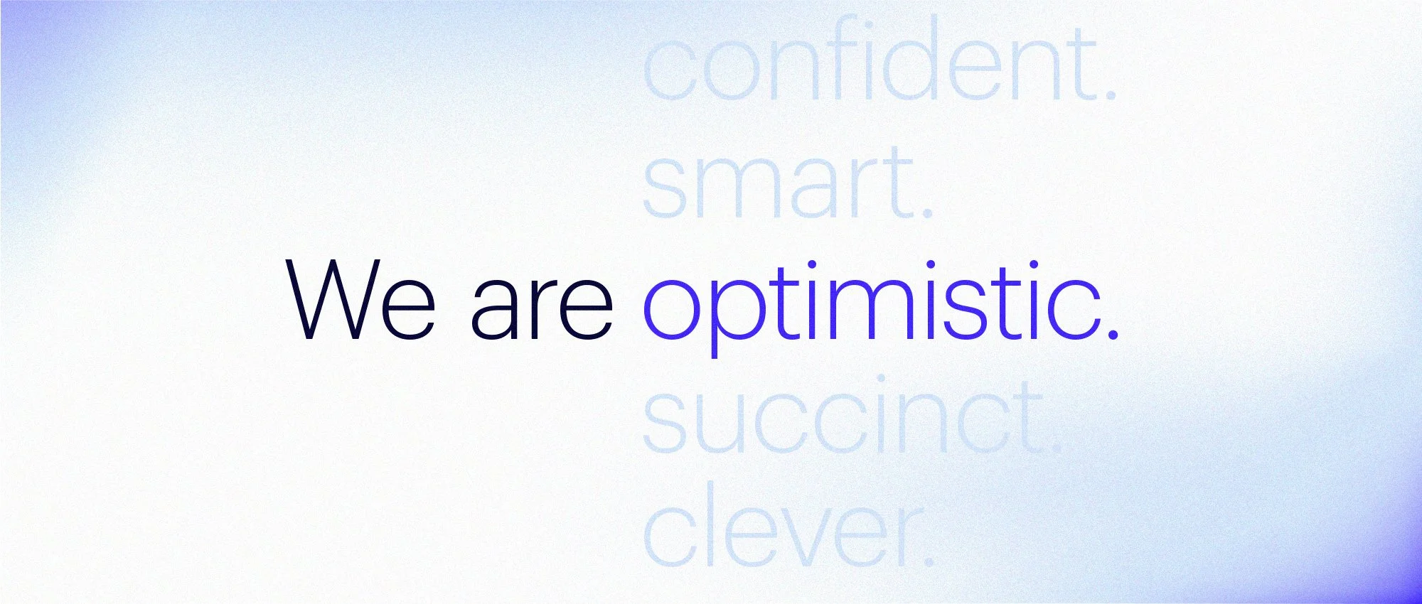
In the decade I’ve spent at Indigo Slate, I’ve had the joy of seeing us grow. A lot. Our own persistence (and tenacity) took our business to even bigger projects and expanded our portfolio of world-class clients. But our brand of creative and technology experts needed to evolve as we had in real life. And so a new manifesto was born, inspired by science and art—pure magic.
Client
Indigo Slate
Role
Branding, logo design, visual systems

Process overview
This brand direction was inspired by alchemy and the scientific transformations between states of matter.
Strategy & research
The first step was soul searching. We held workshops at exec and company-wide levels until we could find recurring themes and shared sentiments. I did visual research, looking for examples of where our competitive opportunities could be.
Design directions
Traditionally a design agency will present three options for a visual direction. We made six. The first three were different versions of the gestalt of the brand. From there, we curated three ideas for concrete visual systems, the front-runner of which was inspired by alchemy.
Visual systems
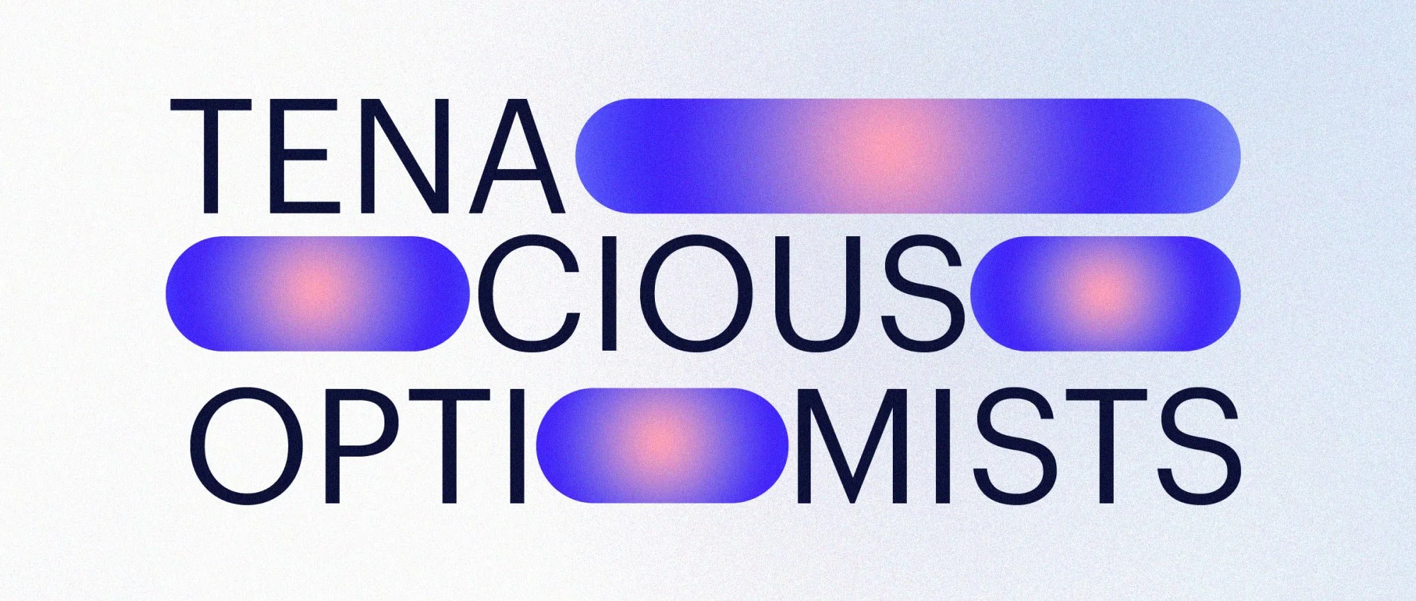
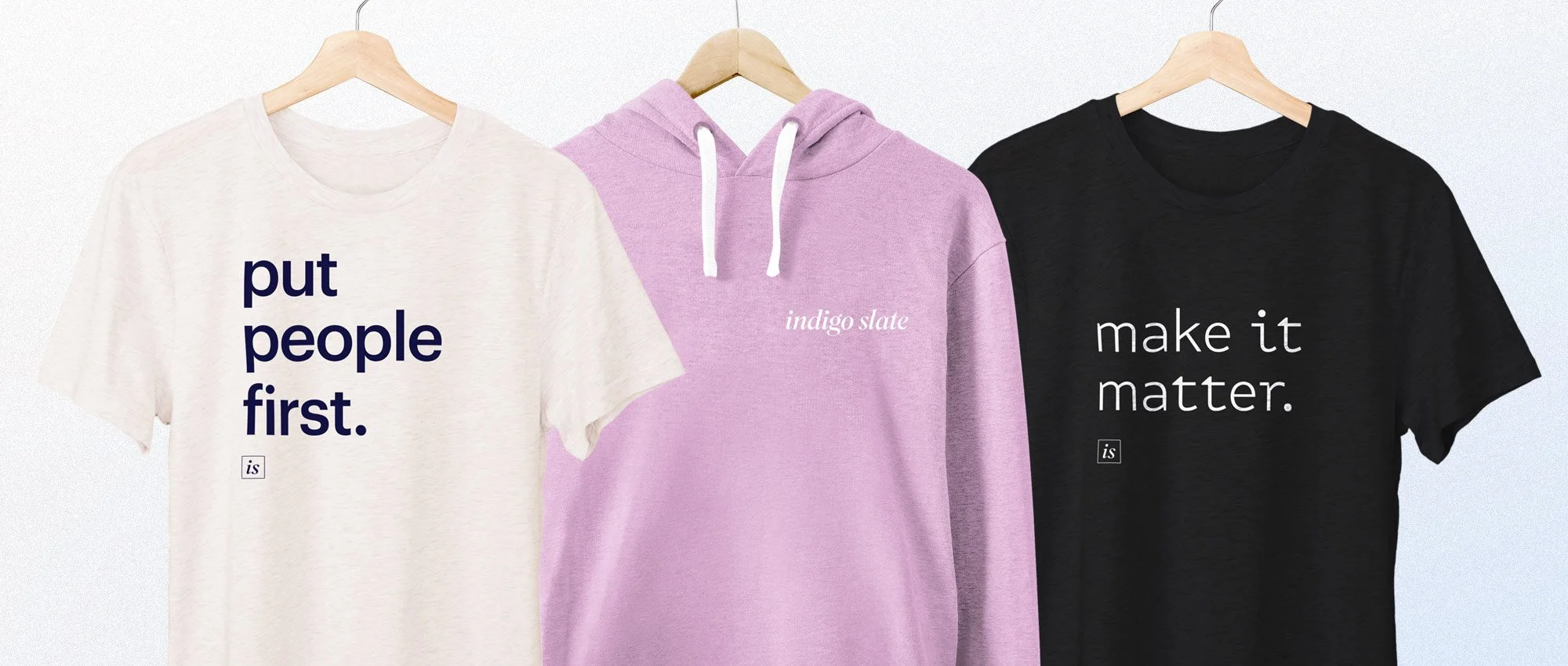
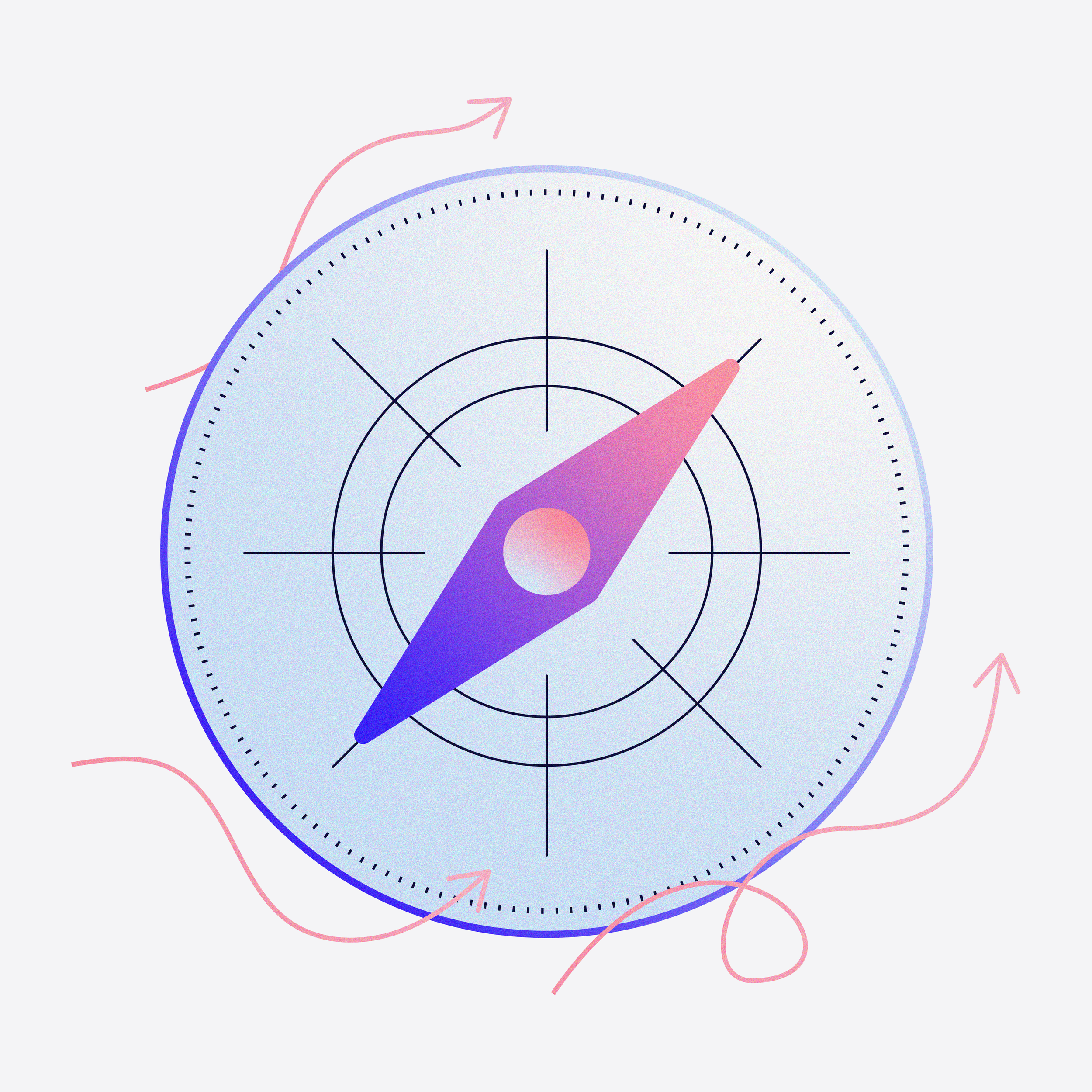
We manifested our science-y and magical dreams! My team and I created and tested a new logo, color palette, font selection, graphic library, website, and tons of corporate swag. The hero of the brand is a painterly gradient, always in motion and evoking passion at first glance.


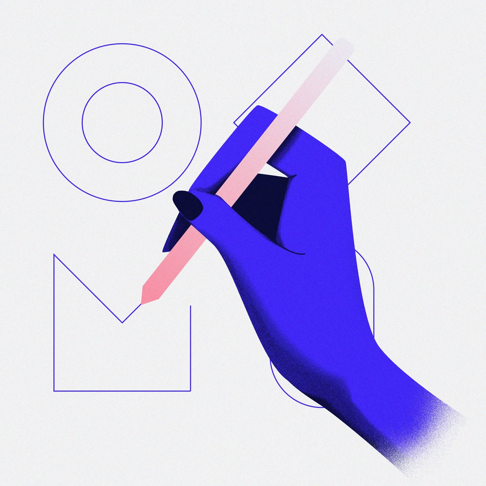


With a name like “Indigo Slate” it was inevitable that we needed the perfect shade of bluish purple. As a primarily digital agency, we chose a color that is digital first— a vibrant indigo that thrives on a screen. But to make the palette distinct for a creative agency in the tech world, I added a statement pink. It’s a blush hue that represents excitement and vitality, but it’s also a reminder that people, clients and co-workers alike, should be at the center of the business.