A tech saga that spans the globe
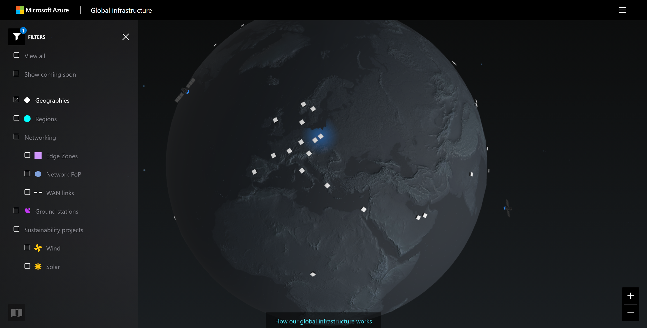
Azure Global Infrastructure interactive map
Microsoft Azure is one of the most powerful and comprehensive cloud platforms in the world. But you cannot tell their whole story without mentioning the vast network of datacenters empowering people all across the globe. When they approached my team at Indigo Slate, their goal was to have a tool that visualized this story in a way that would educate and inspire.
Client
Microsoft
Role
UI, UX, look development

Process overview
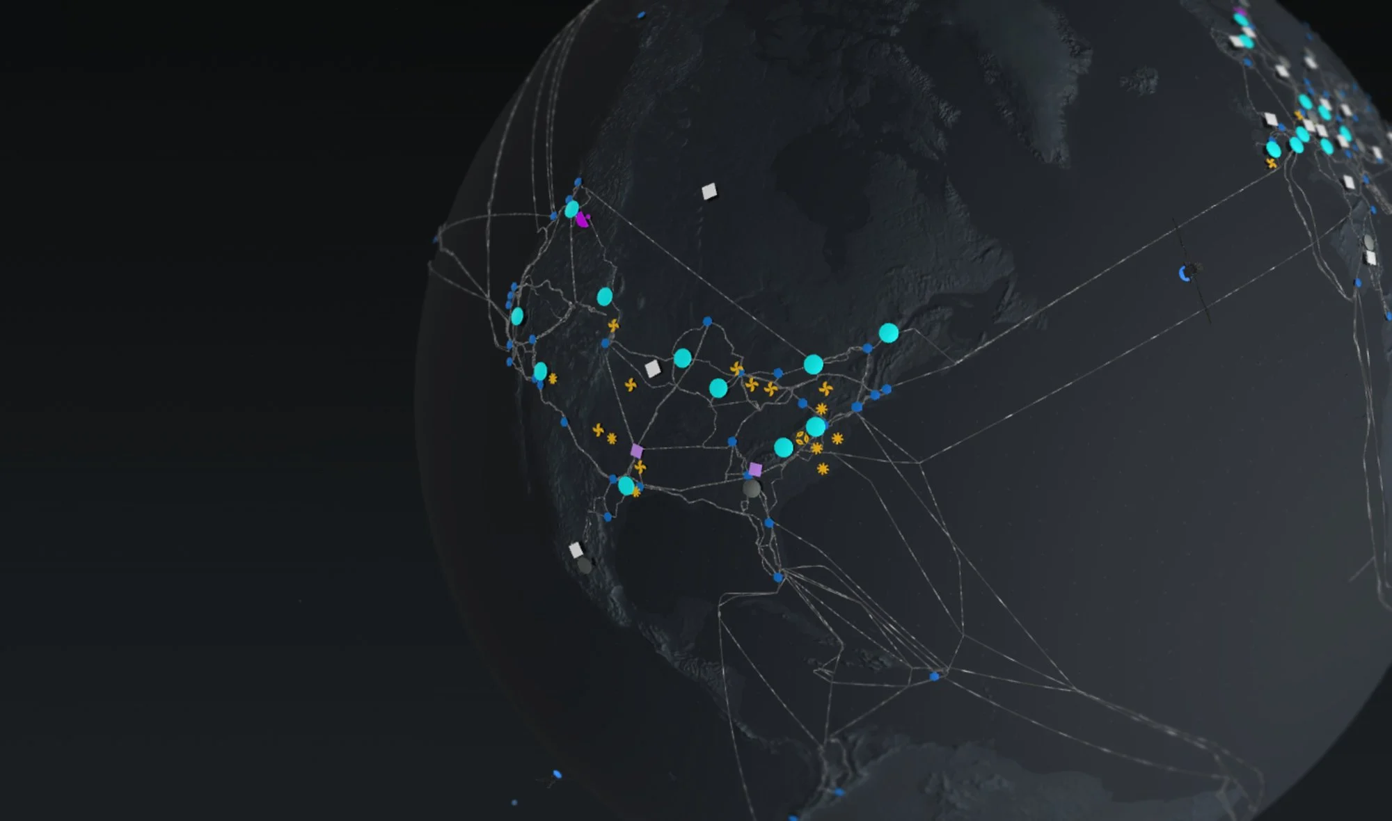
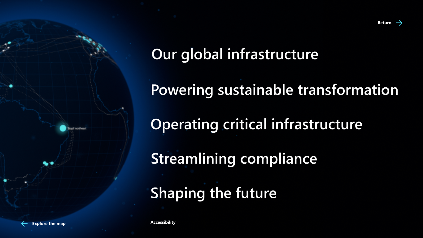
I designed an immersive, 3D, interactive map filled to the brim with stories of Azure’s cutting-edge technology.
Strategy & research
I researched how competitors were telling stories about their datacenters online. While others explained the basics of the industry well, my team identified a gap that Azure could fill—sharing authentic customer stories.
Look development
Datacenters give power to livelihoods all around the world. It’s a beautiful concept, and I knew our globe had to feel the same. Delicate linework, soft glows, and a minimal color palette keeps the focus on the stories and global connections.
UX & web development
Going from a simple map graphic to a WebGL globe was a big jump for Azure. We included filter systems and different view modes, and later versions of the site introduced tours through datacenters and satellite views.


I worked on the art direction and UX/UI of the debut version of this site. The project had a lot of success, giving momentum to several more phases for design and development!